April 5th, 2022
The Confusion Matrix: Why we often use It
Recently we worked on several projects where we used large sets of tabular data from various enterprise data sources and built predictive machine learning models to answer key business questions.
Some of these projects included classification tasks and we used several methods to analyze the performance of our models.
In this series, we highlight some of these methods and try to explain our process in simple terms. For this first article we will cover the confusion matrix and in what ways we use it.
What is its use?
The confusion matrix is a compact way to visualize the results of a model in a classification task. Let’s say, we have built a model that predicts if a customer is going to buy a product based on input variables or features.
For this task, the model predicts one of two classes “yes” or “no”. From there we check to see how well our model has performed.
To do this, we run our model on data previously unseen by the model and where an established ground of truth within the classes of that data is known. We can then compare the predictions of the model to the ground truths.

At this stage, the most obvious question we can ask is how many of our predictions are correct. This answer can be found by running a report metric called accuracy.
Using Accuracy
Reporting accuracy may be enough when the number of data points with the class “yes” and a number of data points with the class “no” are about the same (meaning the dataset is balanced).
However, when the number of data points with class “yes” and the number of data points with class “no” are not the same (meaning the dataset is imbalanced) the accuracy report alone does not tell the whole story. This is where a confusion matrix comes in handy.
Confusion Matrix in Action
For example, consider we have a dataset with 20 examples of which 15 are in the class “yes” (75% of the data) and 5 are in the class “no” (25% of the data).
For this dataset, we use a classifier that predicts “yes” 14 times and “no” 6 times.
Out of these 14 “yes” predictions, 10 are actually of class “yes” and the rest 4 are actually of class “no”. For the “no” predictions, 1 is actually of class “no” and the remaining 5 are actually of class “yes”.
We present all this information in the following confusion matrix:
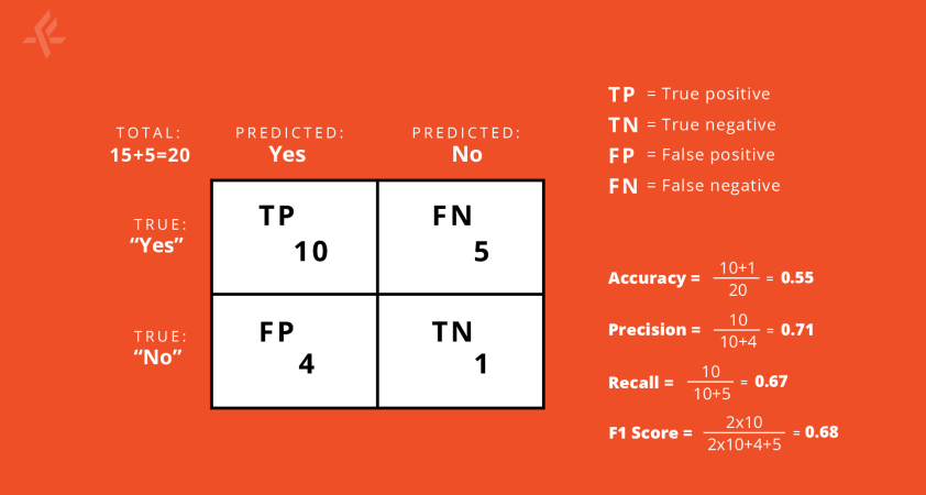
On the vertical line, we put the true labels and, on the horizontal we put the predicted labels. In this scheme, the numbers in the diagonal show the correct predictions.
Therefore, larger numbers in the diagonal indicate good performance of the model.
Calculating Additional Metrics
From this matrix, we can calculate several other metrics. Some of the most commonly used are: accuracy, precision, recall and the F1 score. Accuracy tells us what fraction of the model’s predictions are correct.
When looking at precision with respect to the class “yes”, we are able to see what fraction of our predictions are actually in the class “yes”.
Recall, with respect to the class “yes” tells us out of all the “yes” class present, what fraction we predicted correctly. The F1 score is a harmonic mean of these two.